

We often get asked by customers for advice on which colour schemes would work well in their home. They are often surprised by how different a lot of colours can look when applied to their walls; there are many factors that can affect the overall effect trying to be achieved. Thinking about the position of your room, the lighting, how you use it and how you’ll style it beforehand are important steps to take before deciding on colours.
Natural Light
Natural light has a big impact upon colours and depending on how your room faces; you may get lots of it, or none at all.
South facing rooms tend to get lots of natural light all day long and so most colours will work well and will generally look as expected. However, using some cooler colours such as blues, violets can work as a nice balance against the warmth of sunlight.

North facing rooms on the other hand get very little light and so will generally feel much cooler. Cool tones will only make the room feel darker and so it’s best to avoid these. Make the most of the little light you get by using colours with a warmer undertone, such as pinky-greys, yellow and gold.
East and West facing rooms tend to get more light in the morning (east facing) or afternoon (west facing). Using cooler shades to offset the warm natural light whilst carefully selecting artificial lights that will stop the room getting too cold when the sun moves out of view is good a way to get the most out of your room all day long.

Size of space
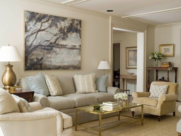
Considering the size of the room you are decorating can help you get the most out of your colour scheme. The bigger the room, the more they can handle darker shades that can make small rooms look even smaller. However, this is not to say bold colours are out of bounds for these rooms; used strategically as a feature wall or on a chimney breast, keeping the remaining walls light or neutral can bring a standout element to the room.

Large rooms can play around a bit more with darker colours as the diminutive qualities have less of an impact. It is the tone of colour that is more important in big rooms – too cool and it will give the room a cold, bare feeling. You can make a large room feel cosy by using colours with a yellow undertone on the walls, or on the ceiling to bring a high ceiling lower. Always complement with a cool white for woodwork to prevent a washed-out look.

Complementing colours
It is common for people to pick a feature colour for their room, with complementing colours for the other walls and tonal accessories such as cushions and curtains. Depending on the neutrals you pick to complement your feature colour, you can either contrast or harmonise. This is done by picking colours with a different or similar undertone to your main colour and will achieve very different looks. Websites such as Dulux give you recommended colour combinations when looking at different shades and a reputable decorating firm will be on hand at the start of your job to help advise.
It's your turn...
If you are thinking about decorating a room in your home and you’d like advice on colours, themes or styles, we offer a free design service as part of our package. Why not give us a call and get us round for a chat? It’s free, as is your quote. Get in touch today and we can arrange a visit.